McDonald’s launches playful redesign of its packaging
In a bid to simplify and modernise its packaging, Pearlfisher opted to highlight the fast food chain’s well-known menu using graphic illustrations
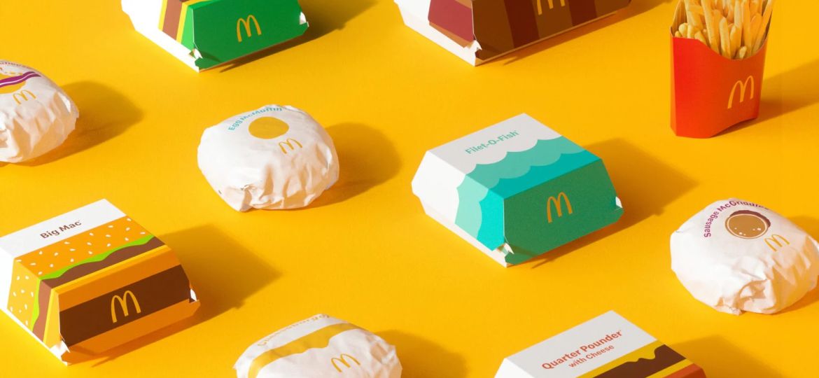
McDonald’s has teamed up with independent design agency Pearlfisher to redesign the brand’s global packaging system. The focus is on a bold graphics system that aims to “bring a sense of joy and ease”, and uses vector style illustrations to represent different items on the fast food chain’s menu.
With over 60 million touchpoints every day, the goal was to make the packaging “more connected and evocative of McDonald’s’ playful point-of-view”, says Pearlfisher. The redesign is a move away from its previous packaging and design system, which featured prominent on-pack messaging and a more typographic approach.
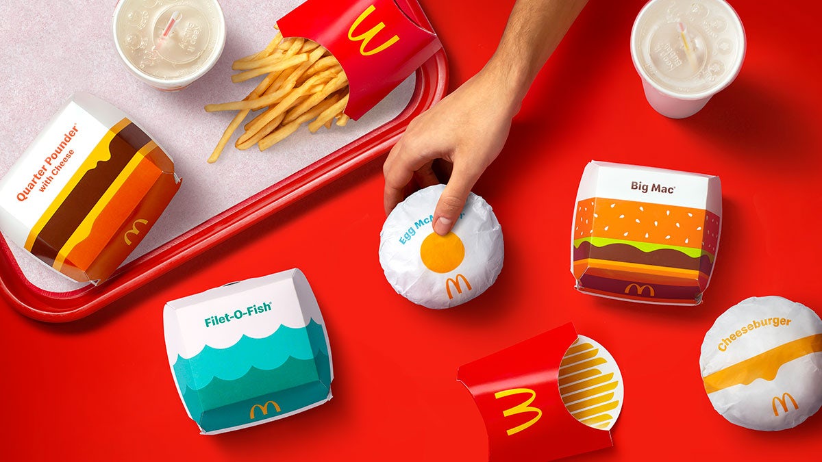
Pearlfisher has ambitiously designed a “single visual framework for the brand’s portfolio of products” by highlighting hero ingredients on the packaging, to create something instantly recognisable to its customers.
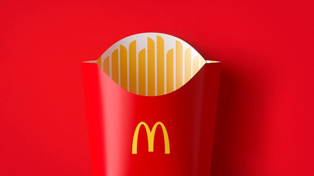
On the Big Mac sandwich box, for instance, layers of the famous burger are captured in a cartoonish cross-section, the McMuffin wrapper is simplified with a big yellow yolk in the middle of a crinkly white background and, although the fries packet remains relatively similar in its red and yellow colourway, there is now the addition of pointy fries on the inside of the box.

“Our task was finding out what was really special about each menu item to design a system that would make it easy for others to do the same,” says Matt Sia, creative director at Pearlfisher. “There’s beauty in the simplicity of McDonald’s’ iconic menu items. We aimed to find the most special, recognisable and iconic expression of each – celebrating them in a way that makes people smile.”
Sia says the team tried to bring personality through simple illustrations to allow the packaging to be functional, easy to identify, aesthetically minimal and emotionally joyful. “Everything in this system has a purpose and helps activate McDonald’s’ brand positioning to make delicious, feel-good moments easy for everyone,” he adds.
It also signals a move towards modernity for the brand. “We’re proud to debut this redesigned system,” says Barbara Yehling, senior director of global menu strategy at McDonald’s. “Pearlfisher helped to ensure that this redesign modernises our brand, highlights the specialness of our menu, and delivers on our commitment to quality.”
McDonald’s is the second fast food restaurant to debut a new look this year, following Burger King’s mammoth rebrand making design headlines in January. Though both have approached the task differently, it’s clear that even established brands need to update their look and re-communicate who they are to customers.
Source